
About six years ago I began teaching how I make my floral quilts. At the time I decided to teach the class in such a way that students would learn about value and would have to make their own fabric choices (with some guidance of course). They were provided with a pattern that included the outline of the flower and all it's parts, with letters and numbers indicating the part, as well as a photograph of the original flower to make their fabric decisions from. Many students turned out fabulous works and surprised themselves by being successful with this project. A few were frustrated at not having a pattern that told them where the appropriate value and colour should be placed. My patterns were used exclusively in the classroom and were only available to students in conjunction with instruction.
When I started publishing patterns last year, I knew I would have to publish them for a diverse group of quilters, many of whom would want the pattern designer (me) to tell them exactly where each fabric should be located. I published the Sunkissed Poppy pattern (second photo below), and the result was that some students in the class were working from a new pattern that told them where to place their fabric, and some took on the challenge of making those decisions themselves.
The bottom line is that I have three designs available at the moment for workshops where you would like all the information, where the challenge of choosing values and colours is less pronounced. They are as follows:
Peony:
(requires 6 values of pink, 6 values of green, and yellow for the flower centre)

Sunkissed Poppy
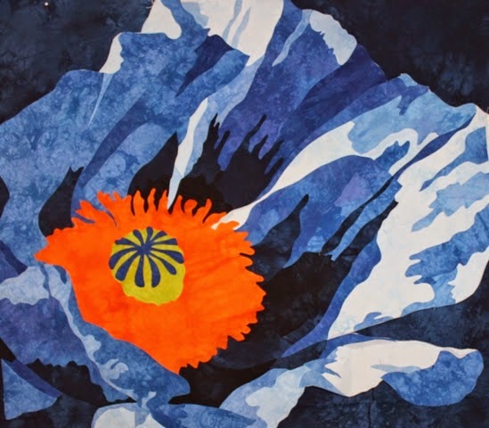
(requires 11 values from soft yellow, to stronger yellow, to orange and peach, through several values of scarlett and into a burgundy and purple/burgundy). There is even a colour chart on the back of the pattern, which makes me fear that students will want to have EXACTLY the fabrics I have. The truth is that this poppy will turn out just fine with eleven values from lightest light to darkest dark, plus a colour for the background, and central portion of the poppy, and a tiny bit of green in the centre.

Don't believe me? Well here is the proof. I chose 11 values of blue, from the very lightest all the way to the deepest navy, and followed the pattern. Added an orange and chartreuse in the centre, and voila! So here is another colour option for this pattern.
Below are the four patterns I used when I taught the class in such a way that students made all fabric choices for themselves. Of course they had my quilts there to help with their choices, along with the photograph of the flower.
Kissing Joy

Queen of the Night

Luscious

Smitten

I'm one of those people who don't necessarily see value and would appreciate more detailed instructions but I have been known to go off the beaten track (so to speak) and try making my only colour choices but would appreciate being able to refer to the pattern if I got stuck.
ReplyDeleteI'm wondering will these patterns be available for purchasing in stores?
Jackie, I think it takes practice to see value. My first attempt at value contrasts was not nearly as dramatic as it is now. So if students want to take home a successful work without doing those many hours of practice, it is probably best I put the information on the pattern. These patterns will be sold from my website. Many already are. Those students who choose to make these designs but make their own colour and value choices can still do so.
DeleteSince you asked for our feedback, I'll bite, although I must warn you that usually whatever I think is completely opposite to what most others think.
ReplyDeleteOne thing that struck me when I looked at the pictures of the completed quilts was the light source and resultant shadows. I think it might be worth saying something about the light in the pattern so that people will understand why the different shades fall where they do. Then maybe you only need to label the pattern as to where the dark, light and medium values go, without going into great detail for every single piece. It would provide direction but not be prescriptive.
Just a thought.
I appreciate your opinion Suzanna. I personally don't like things to be prescriptive either, but I hope this will address both the student who wants more detailed information, as well as the one who wants to run with their own colour and value choices. In the latter case, they can use the design, but ignore the value/colour number on the pattern. It also will make me feel more comfortable selling the patterns to those far afield who have asked for them but cannot make it to one of my classes. I think most patterns on the market do provide this information. I still plan to talk about value, and show in class where the light and shadows fall and why.
Delete