ELAINE QUEHL, Quilt Artist, Teacher, Dyer, Designer

Sunday, January 31, 2016

Standard Mat, Low Tack Mat, or Mid Tack Mat??? Fusibles and the Brother ScanNCut

Remember the collage trees I have made in the past? Like this one, named "Branching Out"? I really think my new Brother ScanNCut machine would be great for cutting the bark pieces I use to collage the trunk and branches.

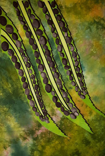
The fern project I made a few weeks ago went smoothly because I used the old Steam a Seam Lite fusible web (the one with only one backing paper). It had just the right stickiness (not that much) for the Standard Mat. This fusible was discontinued, so I've been experimenting with Steam a Seam Lite 2 (two backing papers). It turns out that this fusible is far too sticky to use with the Standard Cutting mat. It actually left a layer of fusible web across the entire mat that I had to scrub really hard to get off. 

It then occurred to me that cutting with the Low Tack Mat (instead of the Standard Mat) might be a good idea. I was right, that worked just fine. I repeated the experiment today, and yes I have concluded with certainty that the Low Tack Mat is the one to use with Steam a Seam Lite 2 fusible web. You can see here how well it cut.

One thing I have finally learned is to run a test cut before committing to cutting an entire sheet of shapes. That way if you get the settings wrong, or you choose a mat with more or less tack than you need, you will only gum up or slice through part of your mat. So today I drew only one piece of bark and scanned it in.

I still have a fair bit of Pellon Lite EZ Steam from two years ago when Steam a Seam products were unavailable. The Pellon product is way too sticky for the Standard mat too, and it did not work very well with the Low Tack mat either. So I have concluded I will not be using the rest of this fusible web as I do not like it for this, or any other purpose..

I also noticed when cutting bark that some of my shapes weren't fully cut out, or had wiggly edges. That would be because in my original drawing that I scanned (below), I did not close in all my shapes with my marker, and some areas almost had a double line where two lines met. I redid my drawing today and re-scanned it.

I also tried a few other fusibles today. Because it doesn't have that sticky re-positionable adhesive like Steam a Seam products, Wonder Under works well with the Standard Mat.

I cut a beautiful sheet of bark using Wonder Under fused fabric and the Standard Mat.

Here are the pieces after I pulled them off the mat and laid them on the release paper for storage.

I also tested TransWeb with the Standard Mat. It did not seem to stick to the mat enough, so you can see that the pieces were lifting off the mat while they were being cut, and this did not result in a clean cut. I won't be using this fusible with the ScanNCut either.

I gave another try at cutting bark with the Low Tack Mat and Steam a Seam Lite 2. It worked beautifully, and for this I am thankful, as it is my fusible of choice. I need the pressure-sensitive, re-positionable adhesive for the works I make that are comprised of a lot of little shapes. The design sticks together while you are building it. The ScanNCut can cut these shapes faster than I can. You will notice that I made sure to create a variety of sizes and shapes because I want this to look natural.


Despite a good cut, you will need to keep your mat clean. There will always be little bits of fabric and sometimes a smidgen of fusible, left behind. I read on-line about using baby wipes to clean the mat. I tried them, and they do work well. 

I opted for the unscented ones because I just don't want a lot of perfume circulating in the air in my small studio.

I am now through a lot of the experimentation with fusibles and mats, and am ready to tackle another project and confident the Brother ScanNCut can handle my preferred fusible, Steam a Seam Lite 2. Oh, and by the way, there is also a "Mid Tack Mat". I haven't needed that one yet.

Monday, January 25, 2016

Free-Form Curves

I am really enjoying being home for the month of January and not having a lot of pressing deadlines. So I've just finished dyeing 32 meters of blues, blues/purples, and purples in preparation for upcoming teaching travels. Half of them are soaking in a cold water soak, and the other half has been washed out and is drying on the line in my basement.

The other thing I've been enjoying doing is updating class samples. It is fun to make things using the methods I teach, without any pressure to make something that is show worthy. So in the last couple of days I've turned out two little samples for my "Free-Form Curves" class. I intend to make new samples for all my "free form" classes. Each is a one day class, and I teach all five methods in my week-long "Serendipity Strips & Curves" class at Haliburton School of the Arts.

The two little samples I made were inspired by this photograph I took at Antelope Canyon, Arizona. I was not expecting the pieces to look like this, but rather be an abstraction of what I see there, and I also wanted the colours to be inspired by this photo.


The first piece I turned out looks like this. I wasn't totally happy with the orange ending up to the left and right of the yellow, but I'm not unhappy with the piece. It's just that the result isn't quite what I envisioned.

Such is the nature of free-form piecing. One has to be open to what one gets to a certain extent. In my second piece, I addressed the orange on both ends of the yellow by making the orange more central.  I'm happier with this one.

I've also been experimenting with cutting tree bark for tree collages, using my Brother ScanNCut. I learned a lot during that exercise that I am going to share in my next blog post.

Oh, and remember the negative shapes left when I cut out all the circles for my fern quilt? I've fused them to a multi-coloured hand-dyed fabric, and now I'm going to cut it up and play at a design. However, it does make me happy looking at it just the way it is.


Monday, January 18, 2016

What's Up?

We are experiencing a snowy Monday here in Canada's Capital, but hey it is winter, so what can we expect?

I thought I would share my conclusion about the fern quilt. This is the background and the setting I plan to fuse it to and finish it on. 

I am enjoying a fairly quiet month with just a few speaking and teaching engagements. Last Monday night I drove out to Kemptville, Ontario, to deliver a lecture to the Kemptville Quilters Guild. My student, Bev Cooper, brought some of her Show and Tell. Bev started this very colourful quilt in my "Reflections" class in November 2015 at the Upper Canada Quilters Guild. In this class students learn how to cut curved blocks free-hand, and are shown several options for designing with them. Bev used many of the fabrics she dyed in my "Dye Happy" class at Wabi Sabi last year. Isn't this piece stunning? Bev is always an inspiration, not only in the work she produces but in how fast it comes together. 

Bev then went on to create a second piece using this method. I love the way she has turned her blocks on this one and the way the piece emits light from the off-centre focal point. The small secondary square of green in the lower right adds an element of surprise and repetition, and the small touches of orange provide a nice complement! Both quilts are already beautifully machine-quilted on her domestic sewing machine

Bev also found a use for the poppy panel from my Northcott "Poppy Passion" fabric line. Lovely, isn't it?

Saturday I had a great time teaching "Intro to Fabric Dyeing" for the Ottawa Valley Quilters Guild.

My impression is that students had a great time playing with colour. Just look at the smile on Lynn's face.

I'll be teaching my "Dye Another Day" class to the Ottawa Valley Quilters Guild on Saturday, January 30. More fun getting messy with colour :-)

The tables are clear in my studio for more studio time this week :-) But I also need to dye some blues and purples.

Tuesday, January 12, 2016

Now We're Talking!

Most of the time when I design a new quilt, I already know what colour all parts will be. My foray into fern leaves left me unsure when the white didn't quite excite me as much as I thought. Thank you to everyone who posted suggestions. Did anyone notice I can't count in my last post? There were only 12 options, and not 13, as I reported. What a difference a new colour and a different orientation can make! I tried about 30 different options today and have narrowed the background colour to four. And yes, I did consider all suggestions made to me.When I've narrowed down to one or two I'm going to do more orientation tests and add all the fronds. Thanks to Catherine Hornstein who suggested I actually turn this on its side. So here are my 5 options:

1A

1B

 1C

 1D


 2A

 2B

 2C

 2D

3A

 3B
 3C
 3D

4A

 4B

4C

 4D

My conclusions are as follows. I LOVE 1A and 1B. The reddish brown/deep purple fabric really sets off the green leaves. I find it elegant. 2 is soft, but too much like what I would normally do. I love 3A, 3B, and 3C as well. The multi-coloured fabric really sets off the fern leaves and adds a lot more interest. Of the 3's, 3B is my favorite, with that gold spot coming up from the lower right as though the sun were buoying the fern leaves. 4A and 4 B are pleasant to me too, but more pleasant in person than in a photograph, where the background looks brighter than it is. I do believe I've just settled on my two favorites. For colour, it is definitely ONE or THREE.

Monday, January 11, 2016

Thirteen Ways to Mount Fern Leaves

Great to see the sun on a Monday morning after a stormy Sunday! Along with getting hosta patterns folded, and revising all my tree patterns for classes in South Carolina, I finally ironed and cut about 30 meters of mostly green fabrics that I dyed late last year. This gave me a couple more possible backgrounds to audition my fern leaves on.

Now I present all 13 options I considered. I'll tell you what I think, and then you can vote if you'd like.
One: I don't mind this one as the ferns pick up a similar green in the darker background and make it all look part of a forest scene. But it doesn't make my heart sing.

Two: Similar to above but earthier. Even more like a forest scene. Doesn't make my heart sing. This one and number one above may be too realistic in looking like a forest scene for the graphic abstract look I was after.

Three: Not really. Was thinking the hint of a complement of purple might set them off. It does but looks like the ferns don't belong there.

 Four: A little light shining through the forest. Makes the ferns disappear. Can you tell I was getting tired of pinning, unpinning, and repinning the ferns again and again on different backgrounds in order to take a photo?

 Five: This is a piece of fabric dyed while folded, so it has bars of blues running vertically. The white spots look like light on a lake at night. I could paint them, but no this doesn't do it for me either.

  Six: A splash of pink, orange and yellow. Nope.

Seven: In keeping with the same greys in the circles on the fern fronds, I tried a background of grey. Dead and drab. Nope.

Eight: How about a lighter value of grey? Nope, still dead and drab.

Nine: Thinking a little hint of  pink in the green might make them pop. Not crazy about this one either.

Eleven: A brighter green. No.

Twelve: Green with a little blue and soft red-purple thrown in. Not there yet. The background seems too busy.

Thirteen: Which brings me back to a white background. This photo doesn't look as crisp and white as in real life. I am not in love with it, but it is still my preference. Thinking I might rev it up with interesting machine quilting, face the edge, and mount inside a modern black float frame. So that's the plan now.

Feel free to weigh in with your choice and let me know why.